Essentially, all models are wrong, but some are useful.
— George Box and Norman Draper, Empirical Model-Building and Response Surfaces, 1987
Introduction
Statistician George Box was a man with a conditional love of models. He maintained that, while simple models can approximate reality, no model could entirely represent the real world exactly. Despite this inability, Box did allow that a model could “supply a useful approximation to reality,” rendering it a handy tool.[1] It is with this wary consideration in mind that I investigate how modeling methods influence our understanding of Roman villas.
Architectural models are useful tools in that they enable scholars to better understand their research subject and allow members of the public to better engage with their cultural history. As Mount Holyoke professor Michael T. Davis shared in his presentation at Duke University’s 2016 digital humanities symposium, “we, as a species, tend towards a stubborn positivism, demanding sensory and—I think, above all—visual confirmation as the means by which we, in the words of Thomas Aquinas, “gather the intelligible truths of all things.”’[2] Interacting with a visual model can bring history to life for schoolchildren, inspiring greater investment in local communities, in a school subject or in a career path. For historians, building a visual model can test literary and archaeological evidence against the realities of gravity, humidity, time of day or year, and sight lines, among other physical restrictions to reconstruct what was probable in the construction or arrangement of a building.
From 19th and 20th century to present day rediscoveries sites, Roman buildings have proved a rich area for modeling projects. Since they typically survive as limited remains or as wonders that dominant scholarship decided should concern the world at large, researchers required a means of compiling their observations into a cohesive and observable form for their peers, resulting in that sensory, visual confirmation of a model, as Davis mentioned.[3] Sites such as Pompeii have proved especially fruitful, given the relative volume of preserved evidence unmediated by further societal interventions until its mid-eighteenth century rediscovery, enshrining the site in the collective archaeological imagination. But locations with fewer intact architectural and material remains, such as the United Kingdom, have also inspired interest in reconstruction. When first approaching this paper, I planned to direct my geographic focus to models of Romano-British villas, since Britain maintains such visible enthusiasm for reliving its glorious history.[4] However, between limited interest in digital reconstruction of these numerous villa sites, the departure of the provincial architecture from its Italian counterparts, and the democratic audience targeted by Britain’s physical modeling projects, such a scope proved too limiting. Consequently, this study includes models of villas from both Pompeii and from Britannia.
Villas are particularly interesting sites to reconstruct, since Roman home structures tended to be locations that fluidly melded the public and private spheres as we now understand them. For instance, villas of Britannia were often part of a larger farming estate that would adjoin granaries and also acted as the place where the dominus would conduct business and shelter the household.[5] Pompeian villas operated similarly, with fluidity between public business and private domesticity.[6] Until recently, scholars set out to uncover the fixed purpose of a room, but with the holistic incorporation of anthropology, archaeology and social art history into both written scholarship and models, that pattern has shifted towards a greater emphasis on letting the evidence on the ground speak for itself, encouraging scholars to draw conclusions from the evidence rather than theory.[7] Reconstruction models help scholars experience the evidence sensorially to uncover the otherwise unforeseen in the most likely mundane realities of life within these villas. Investigating villas provides human connection not just for scholarship, but also for average citizens, as well, allowing them to envision themselves in these histories so to bridge the relevancies of the past and the present.
History of models as a means of reconstruction
Before digging into the villa models specifically, however, I first wish to progress quickly through the evolution of archaeological architectural models and how the conversation around models has remained relatively static, despite the extended time frame and shifting media. As Stefano de Caro recounts in his introduction to the 2002 book Houses and Monuments of Pompeii: The works of Fausto and Felice Niccolini, “[a]t the very moment that creating a “virtual” Pompeii in the interest of conserving the ancient city has been put forward, here is an opportunity to present Le case ed i monumenti [(originally published 1854)], which in its own way was the first virtual Pompeii.”[8] Clearly the discussion around models persists unabated.
With the early-nineteenth century growth of archaeology as a discipline and an increasing cultural concern with the scientific, models became a pressing preoccupation. As Roberto Cassanelli describes in his essay on “Images of Pompeii: From Engraving to Photography,” the early forms those models took included both traditional modes of representation—sketches, watercolors, gouache paintings, lithographs and engravings, and ground plans—as well as developing technologies—photography in the form of daguerreotype and collotypes.[9] While not models in the sense of allowing the viewer to sensuously interact with and imagine the space, these two-dimensional renderings opened the discussion ongoing in modeling projects to present day, specifically the debates over whether a model is a greater reflection of the perspectives of the modern culture than the realities of the ancient evidence and whether a model is more dangerous than useful, as it can take on a life of its own by creating a sense of certainty that disregards the nuances of historical evidence and educated conjecture.
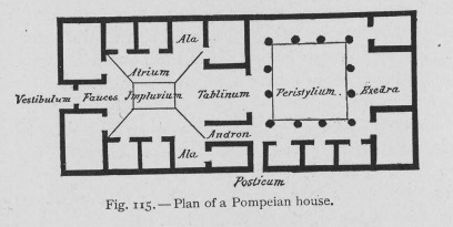
August’s Mau’s model of the ideal Pompeian home from his book Pompeii: Its Life and Art captures both issues beautifully. He begins the chapter on Pompeian houses by acknowledging how source material on domestic architecture in Italy is limited to Vitruvius’ treatise De architectura and the remains of Pompeii itself. He goes on to provide his conclusion that, despite “many variations from the plan described by the Roman architect [Vitruvius]”—Pompeian houses should still be understood to be in accordance with the treatise’s particulars.[10] After proving his general findings on the houses of the city, he supplies the reader with this ground plan model for the Pompeian house (fig. 1). This ground plan has taken on a life of its own, taught in survey courses and introductions to Pompeii across the United States with minimal intervention complicating the reading of it so as to be useful for general study, but neglects to problematize which evidences are privileged in model creation. In this case, Mau showed deference for the literary evidence rather than allowing the archaeological evidence to guide the design, which is not made clear when taking the model out of its context within the chapter, as it so often is. That preference for privileging the textual evidence also has little to do with the quality of the evidence available in Pompeii and everything to do with the way that scholarship was conducted during Mau’s time.
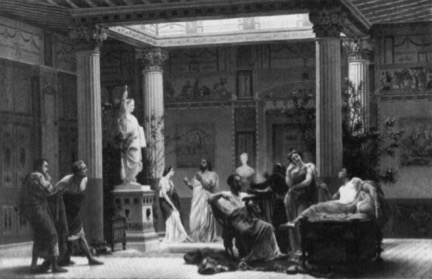
Prince Napoleon III’s Pompeian mansion reconstruction is even more reflective of the early conversations around models being more reflective of their own time than the archaeological reality. The prince’s architects modeled the palace on Pompeian villas such as that of Diomedes and the House of Pansa. The court received the reconstruction as “a rigorous restitution, … a deeply learned archaeological treatise written in stone that can be inhabited,” while also believing it “to be a symbolic expression for a modern imperial lifestyle…[that held] up a polished patrician mirror.”[11] This palatial model acted as a lens for present day concerns, not reconstruction for the sake of understanding the archaeological past. The model suited, instead, the repopulating of the Roman past with contemporary concerns and behavior, as is evident in Boulanger’s painting of a rehearsal in which the friends of the prince combine “archaeology and fiction…[by] emulate[ing] what they imagined to have been a Pompeian life of elegant leisure” (fig. 2).[12] In this case, all historical integrity is lost due to the nature of the reconstruction serving as a playhouse rather than as a true model.
The debates around how models mediate our understanding of the sites they reconstruct continue regardless of the evolution in media for reconstruction, moving through physical small-scale models, large-scale reconstructions, 3-D computer assisted drafting, visually immersive 3-D video, fully immersive 3-D gaming technology, and artificial reality.
Physical reconstructions
Model 1: physical, small-scale model of the House of the Tragic Poet
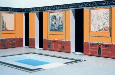
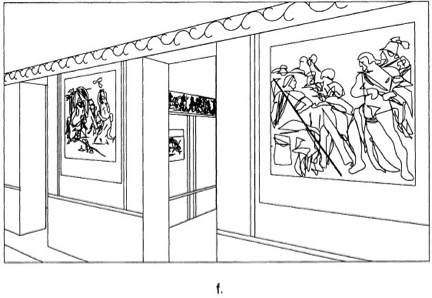
The second century BC House of the Tragic Poet in Pompeii has received significant attention from archaeologists for its apparent agreement with Vitruvius’ observations in De architectura on the properly arranged and proportioned home.[13] As part of that attention, a number of models have been constructed of it. The small-scale physical model Bettina Bergmann uses in her article on “The Roman House as Memory Theater” (fig. 3-4) is particularly relevant to an investigation of how models are and are not useful in expanding knowledge of the Roman villa. She uses the model in conjunction with another computer assisted line-drawing reconstruction (fig. 5) to recontextualize the conception of the house and its decoration so that it prioritizes the likely realities of viewing and moving through the environment, as supported primarily by the archaeological record and then performed.[14]
Throughout the paper, she uses the physical reconstruction supported by the computer assisted line drawing model to draw conclusions about the strength of previous and contemporary scholars’ supposition regarding how the villa acted “as a frame for action” within the assumed social structures of private and public. Of these model-supported conclusions, she feels confident confirming the idea of the axes of private and public social differentiation based on the sight lines and wall painting indicators.[15] The model also allowed her to recontextualize the wall paintings, as they were removed from the villa and now reside in the Naples Museum in an order imposed by the institution. By drawing on the artistic rendering of the wall paintings within the rooms by archaeologists who experienced the villa after its rediscovery and before it decorative deconstruction.[16] Based on the finding of the wall painting series, Bergmann’s model undermines the traditional view of the House of the Tragic Poet as a “Homeric house,” since the order of the wall paintings does not suggest a cohesive, linear story of the Iliad being performed.[17] Instead, Bergmann suggests a new conception of the artist, one that gives them agency and credit not only their formal skills, but also their dialectic, analytical skills to create panels that were “composed in relation to each other and for th[e] space” based on repeated and responsive compositional choices that only become obvious when examined on the walls in their original order in the reconstruction and restoration enabled by the model.[18]
While Bergmann’s article provides a strong argument for the value of models as a scholarly tool in uncovering and testing theory on the Roman villa, neither argument nor model is without its flaws. The desire to repopulate the model with a figure is misleading, as the visual of a lone figure in the space leads one to believe that it might have been the wall paintings alone that directed traffic through the house, instead of other people, such as slaves. The model also misleads in the gallery-quality emptiness of the rooms. As is evident in model 1 of the digital reconstruction in the next section, having objects in the space entirely alters the way that a viewer might progress through the rooms or interact with the wall paintings, since they’re partially obscured. The model leads to the treatment of the Roman villa as a painting gallery, rather than a lived-in space.
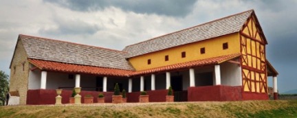
Model 2: physical, large-scale model of the villa at Wroxeter
Full-scale physical models pose a different set of virtues and problems. The villa reconstruction at Wroxeter, England is one such model (fig. 6-7). The villa itself, a hybrid of the winged-corridor and courtyard villas common to Britannia (fig. 8), was located near the significant Roman settlement of Viroconium (now Wroxeter), a bustling city center and legion encampment, rediscovered in 1859. In 2010, English Heritage took on the project of reconstructing the villa to scale using ancient Roman building methods under the direction of Chester University’s professor Dai Morgan Evans. Channel 4 TV supported the effort in exchange for the building of the model to be made into a television program, “Rome Wasn’t Built in a Day.”[19] While campy and rife with reality television distractions, the program was able to convey the value in testing the literary evidence against the reality of regional environments far from Rome.
Professor Morgan Evans decided to use Vitruvius’ treatise on architecture as the primary guide for how to construct the house, despite British patterns of adapting what immigrants bring to the demands and habits of the region and the fundamental differences in architectural arrangement in the Roman atrium house and the Romano-British villa counterparts.[20] Due to this decision, as well as the lack of household objects and accompanying texts on the finalized site, the model’s value lies not in its final state or public access, but in its testing of the value of Vitruvius’ preparations in a wet, cold environment and whether his treatise would likely have been used outside of a Roman context. In the first episode, viewers watch the mortar mixture, prepared to Vitruvius’ specifications exactly, refuse to set, even over the course of three days due to the moisture levels in British air. The plaster according to Vitruvius was also not compatible with the atmosphere of Wroxeter, cracking in the cold wet of winter shortly after construction completed. The construction methods used in the house were so inappropriate, in fact, that English Heritage has found the cost of repairs and maintenance to be burdensome.[21] This suggests that Romano-British villa owners either set aside funds for continual maintenance or that Roman building practices weren’t translated directly to provincial construction sites, instead depending upon local materials and local building practices in an adapted architectural form.
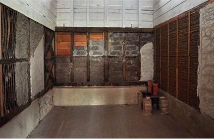
While not valuable in best understanding Romano-British construction methods, the villa model’s final form does hold value in understanding Roman construction methods, thanks to the room in the villa deliberately left only partially finished (fig. 9). Visitors are able to better understand what’s going on underneath the plaster and floors, creating a more nuanced understanding of the site than what would have been possible from the empty, sterile rooms in the rest of the villa’s reconstruction.
Digital reconstructions
Model 1: partially immersive digital model of the house of Caecilius Iucundus
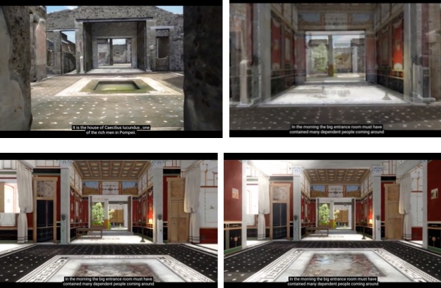
The Swedish Pompeii Project of The Swedish Institute in Rome began in 2000, conceived of as a means of preserving Pompeii’s archaeological evidence through documentation (fig. 10).[22] The team took extensive photographs and laser scans of one of the city’s districts and eventually used the ones they took of the house of Caecilius Iucundus to model a 3-D reconstruction of the villa in video form.[23] By directing the viewer through a realistic rendering of the space with household objects, natural lighting and movement, the model serves to visually immerse the viewer in the environment, creating a sense of being transported back in time. While this is a dangerous means of communicating interpretation, as it suggests to the viewer that it is fact, the designers combat that uncritical acceptance by starting the video with narration and by rendering the villa in its current state and then melding the atrium view into the fully decorated pre-79 AD version of the model (fig 11). They also filmed an accompanying video in which they describe the project and the idea of displaying interpretation in a responsible way within the model.[24] This approach to revealing what’s ‘behind the curtain’ allows the model to be didactically useful, communicating the audience that a model really is just a model while still making a convincing argument for how the atmosphere of the villa may have felt under various environmental conditions. It is a model that creates a realistic atmosphere, though not entirely immersive, since the sounds, smells and living creatures are not included, nor can you control your own movement through the space.
Though in process and not contained in this model, the Swedish researchers also discovered means of interpreting social hierarchies based upon their study of water and sewer systems. With this information at hand, this project has the potential to make one of the first realistic attempts at modeling how different kinds of people moved through the home and the neighborhood, which would be invaluable for improving the repopulation of ancient sites. Thus, the model as it stands currently holds value for villa research in its detailed preservation of the site as it stood in 2000-2010 and its mindfulness about how the environment would have reacted to weather.
Model 2: fully immersive digital model of Pompeii and its houses in Digital Pompeii
The Digital Pompeii Project, sponsored by the University of Arkansas, stands as a contemporary equivalent of Giuseppe Fiorelli’s early cork model of Pompeii’s archaeological digs in its ambition and intention, if not its medium. Directed by professor David Fredrick, the project intends to create a “comprehensive database for visual art and material culture at Pompeii” that supports the 3-D gaming-style model of the entirety of Pompeii.[25] The database will be fully indexed, searchable, and linked to the model’s reproduction of the desired object or building. By adding to the model’s in-game information with the collaborative virtues of networked data, the model has the potential to serve all audiences’ needs, acting a teaching tool for those exploring the homes, serving as a surrogate to physical travel, and increasing the scholarly manipulation of city, which can test new and old assumption with the archaeological evidence.
Within the model’s interface, users can direct their avatar up to point of interest, which will prompt a popup with “descriptions of the wall painting, the myths that it contains, and of the social aspects of why this painting is in this particular room.”[26] This function keeps the viewer aware that this fully immersive environment is evidence-based, but still a model. Though still in development and thus not operational at the moment, the team produced a video describing the process of compiling the visualization data, providing glimpses of how the game-play function will operate, and explaining the risks of the model.[27] To produce the visualization, the team compiled “400 hundred years worth of drawings, etchings, paintings and photographs of Pompeii,” on top of taking their own scans of the site.[28] This process of bringing all of that visual data together into one model ensures a balance of evidence that also documents and renders the current archaeological record of the visual and archaeological evidence up to the present day. As Christopher Johanson notes in his article “Visualizing History: Modeling in the Eternal City,” one of the fundamentally important aspects of digital reconstructions is that they can propose solutions to gaps in the archaeological record.[29] By presenting the archaeological record as it stands, Digital Pompeii allows others to fill in the gaps using the model and the accompanying database in relation to future scholarship.
Conclusion
As Bergmann points out in her article on “The Roman House as Memory Theater,” “[s]cholarly investigation of the ancient interior is like a memory system in that we attach out ideas about Roman culture to its spaces and contents using the methods of labeling and matching.”[30] Models provide the literal house in which researchers can compile their investigative findings and compare them to surrounding evidence. If something does not match, then it must be investigated further to discover where the discrepancy is occurring, in the researcher’s understanding of the archaeological evidence or in the accuracy of the supporting evidence and supposition. From the point of the viewer, a model is mediated means of investigating a home. While the model’s medium and formatting choices can dictate their interaction with the space, they can benefit from the coming together of the information with which the researchers were working. While imperfect for both parties, models, as Box suggested, do supply useful information even as they are imperfect. As this paper suggests, scholarship and public knowledge on the Roman house have benefitted and will benefit from the continued use of models as a tool for research, documentation, and communication.
Images


Bibliography
Bergmann, Bettina. “The Roman House as Memory Theater: The House of the Tragic Poet.” The Art Bulletin, vol. 76, no. 2, June 1994.
Blix, Gӧran. From Paris to Pompeii: French Romanticism and the Cultural Politics of Archaeology. Philadelphia: University of Pennsylvania Press, 2009.
Box, George E., J. Stuart Hunter, and William Hunter. Statistics for Experimenters: Design, Innovation, and Discovery. 2nd ed. Hoboken, NJ: Wiley Inter-science, 2005.
Burke, John. Life in the Villa on Roman Britain. London, UK: B.T. Batsford, 1978.
Davis, Michael T. “Evidence and Invention: Reconstructing the Franciscan Convent and the College of Navarre in Paris.” Paper presented at Apps, Maps & Models: Digital Pedagogy and Research in Art History, Archaeology & Visual Studies symposium, Duke University, North Carolina, 22 February 2016.
“Digital Pompeii.” University of Arkansas YouTube channel, 12 April 2010.
“Digital Pompeii Home.” Digital Pompeii Project. University of Arkansas, 2011.
Dockrill, Peter. “This reconstructed 3D home reveals ancient Pompeii before Vesuvius struck.” Science Alert, 5 October 2016.
Houses and Monuments of Pompeii: The works of Fausto and Felice Niccolini. Ed. Mark Greenberg. Los Angeles: J. Paul Getty Museum, 2002.
Johanson, Christopher. “Visualizing History: Modeling in the Eternal City.” Visual Resources, vol. 25, no. 4, 1 December 2009.
Mau, August. “The Pompeian House.” Pompeii: Its Life and Art. New York: Macmillan Company, 1907.
Nevett, Lisa C. “Seeking the domus behind the dominus in Roman Pompeii: artifact disributions as evidence for the carious social groups.” Domestic Space in Classical Antinquity. Cambridge, UK: Cambridge University Press, 2010.
“Researchers reconstruct house in ancient Pompeii using 3D technology.” Lund University. 29 October 2016.
Rome Wasn’t Built in a Day. Channel 4 TV, London, UK, 2010.
Wallace-Hadrill, Andrew. “Reading the Roman House,” Houses and Society in Pompeii and Herculaneum. Princeton, NJ: Princeton University Press, 1994.
The Swedish Pompeii Project. Swedish Research Council, 2016.
[1] George E. Box, J. Stuart Hunter, and William Hunter, Statistics for Experimenters: Design, Innovation, and Discovery, 2nd ed. (Hoboken, NJ: Wiley Inter-science, 2005), 440.
[2] Michael T. Davis, “Evidence and Invention: Reconstructing the Franciscan Convent and the College of Navarre in Paris,” paper presented at Apps, Maps & Models: Digital Pedagogy and Research in Art History, Archaeology & Visual Studies symposium, Duke University, North Carolina, 22 February 2016. All transcriptions of the video recording of this symposium are my own.
[3] In his paper, Davis acknowledged that while scholars of more modern history find modeling less necessary due to the higher volume of intact architecture, there is value in building these models for all of archaeology, both as investigative scholarship and as teaching tools.
[4] For an impression of present day British attitudes towards historical portrayal and its own history, see Andrew Thomson, “Afterward: The Imprint of the Empire” in Britain’s Experience of Empire in the Twentieth Century, edited by Andrew Thomas (New York: Oxford University Press, 2012), 330-335; Kate Connolly, “Britain’s view of its history ‘dangerous,’ says former museum director,” The Guardian, 7 October 2016; and even the way Britons’ take their holiday according to ABTA Ltd., Holiday Habits Report 2016 (London, UK: ABTA Ltd., 2016).
[5] John Burke, Life in the Villa on Roman Britain (London, UK: B.T. Batsford, 1978), 35; 40-41.
[6] Andrew Wallace-Hadrill, “Reading the Roman House,” Houses and Society in Pompeii and Herculaneum (Princeton, NJ: Princeton University Press, 1994), 11.
[7] Lisa C. Nevett, “Seeking the domus behind the dominus in Roman Pompeii: artifact disributions as evidence for the carious social groups,” Domestic Space in Classical Antinquity (Cambridge, UK: Cambridge University Press, 2010), 114-118; and Bettina Bergmann, “The Roman House as Memory Theater: The House of the Tragic Poet,” The Art Bulletin, vol. 76, no. 2, June 1994, 227.
[8] Stefano de Caro, “Introduction,” Houses and Monuments of Pompeii: The works of Fausto and Felice Niccolini, (Los Angeles: J. Paul Getty Museum, 2002), 6.
[9] Roberto Cassanelli, “Images of Pompeii: From Engraving to Photography,” Houses and Monuments of Pompeii: The works of Fausto and Felice Niccolini, (Los Angeles: J. Paul Getty Museum, 2002), 48-49.
[10] August Mau, “The Pompeian House,” Pompeii: Its Life and Art (New York: Macmillan Company, 1907), 245.
[11] Gӧran Blix, From Paris to Pompeii: French Romanticism and the Cultural Politics of Archaeology (Philadelphia: University of Pennsylvania Press, 2009), p 209-213.
[12] Bergmann, “The Roman House as Memory Theater,” 228.
[13] Ibid., 227.
[14] Bergmann, “The Roman House as Memory Theater,” 226-227.
[15] Ibid., 230-231.
[16] Ibid., 237.
[17] Ibid., 237.
[18] Bergmann, “The Roman House as Memory Theater,” 241-246.
[19] “Episode 1,” Rome Wasn’t Built in a Day, Channel 4 TV, London, UK, 2010.
[20] John Burke, Life in the Villa in Roman Britain (London: B.T. Batsford Ltd, 1978), 32.
[21] “Wroxeter Roman Villa,” English Heritage.
[22] “Welcome to the Swedish Pompeii Project,” The Swedish Pompeii Project, 2016.
[23] “Researchers reconstruct house in ancient Pompeii using 3D technology,” Lund University, 29 October 2016.
[24] Peter Dockrill, “This reconstructed 3D home reveals ancient Pompeii before Vesuvius struck,” Science Alert, 5 October 2016.
[25] “Digital Pompeii Home,” Digital Pompeii Project, University of Arkansas, 2011.
[26] “Digital Pompeii,” University of Arkansas YouTube channel, 12 April 2010.
[27] Ibid.
[28] Ibid.
[29] Christopher Johanson, “Visualizing History: Modeling in the Eternal City,” Visual Resources, vol. 25, no. 4, 1 December 2009, 403-404, 413-414.
[30] Bergmann, “The Roman House as Memory Theater,” 226.
]]>The app provides a vast array of aesthetically cohesive templates, but they’re not terrible customizable. In the ‘Design’ tab, you can alter the inspiration for the automatic selection of the most appropriate color scheme (helpful if all of your images are already color cooperative), the color scheme, font style & size and animation emphasis (AKA text block and media size). In the ‘Layout’ tab, you can select three options for how the flow proceeds.
From the Sway homepage, I chose to start the presentation from a document I had saved to my computer. This generated an automatic template that segmented the text and images into relatively intuitive chunks and headings. It intuited the headings just from the bolded caps lines that I had in the document as placeholders. Anything placed in a table cell (my shorthand for Tip & Tricks boxes) it turns into images. This is a nice idea, but if you have linked material, it’s no longer accessible in the image and needs to be reformatted as text. The media additions were relatively intuitive and responsive, and embedding on Sway is by far the easiest embed process of any platform I’ve worked with.
With the limited levels of customizability in exchange for pre-curated designs, Sway operates as PowerPoint for those who are more comfortable with a WordPress visual editor approach to user experience; there’s a button for all the functions, and there aren’t too many buttons.
This app works best for small presentations that aren’t terribly text heavy, as well. The assignment required us to select a focused topic and write up a multimedia mini blog post (500-1000 words). Even with the mix of media and the limited word count, it still proved challenging to keep the text dynamic and visually pacing. If coordinated with a formal verbal presentation, I could see this app as a major time saver and means of cutting down on design stress.
It strikes me that the main virtue of Sway is that, once you get over the relatively small learning hump, it’s a quick and dirty means of creating a low-input, low-stress presentation that looks like you put more effort in than you did.
Take a look:
To see how all of the individual Sway presentations embed into one presentation as a compilation, check out the class Sway presentation that our professor Denise Anthony put together:
]]>To see the accompanying notes, click the gear underneath the presentation to select ‘Open Speaker Notes.’
]]>Tiki-Toki
To see the Tiki-Toki timeline, click this link:
http://www.tiki-toki.com/timeline/entry/623027/The-Grab-Slamin-Family/
Inputting data into this timeline wasn’t too bad, but the subsequent visuals just weren’t doing what I was aiming for.
First of all, the data input isn’t into a spreadsheet. Instead you’re creating entries based on a type: span or story. Though consistency is harder to maintain due to the lack of database (and input takes far longer), the instructions provided by the interface a helpful and clear, so you can personalize each entry as you prefer. Spans are a new function, so perhaps that’s why they don’t work as well. I tried creating spans for lifespan of some Grabs. As far as I can tell, there’s no way to better clarify where on ends if multiple are overlapping. The stories are easy enough though. Stories are marked by little lighting bug-looking things on the slider bar and appear like chat boxes on the timeline itself. These lightning bug indicators, as charming as they are, would be problematic if you’re looking for something with more textual clues as to what’s going on from the slider bar. N.B. You have to actually click “More” at the bottom of a chat box if you want to read an entire entry—you can’t just click anywhere in the chat box, which is what my intuition called for.
Secondly, the photos from Flickr just would not work, so I ended up linking to the copies on Facebook (linking is meant to save you and them storage space, so there’s no download option). Then once (if) the links work, the span images aren’t adjustable, so you have to hope that your photo is composed with the primary area of interest concentrating in the exact center. Mine were not, so you’re getting a lot of midsection and no face on people. The linking goes for all media, as well. I wanted to include an mp3 from my desktop, but needed to upload it to SoundCloud in order for Tiki-Toki to acknowledge it.
The really cool feature of Tiki-Toki is in the visualization. It has a 3D option. Instead of scrolling right to follow the timeline, your traveling down a road and the events slide past you. It reminds me of a cheesy ’80s time travel movie. So, not great for for academic settings, but a cool toy for at-home use. Also handy: Once you’ve input your data, you can print it, or it can be downloaded as a PDF, CSV or JSON file. There’s a super handy little embed tab, too, but that’s only accessible if you have a paid account rather than a free one, which is why I’ve only linked to this timeline, not embedded it. Tiki-Toki also has a group edit function, so other can contribute if you’d like.
Timeline JS3
Timeline JS provides a Google spreadsheet template into which you can enter your data. Be careful not to alter or delete any of the column headings, otherwise it won’t translate back into Timeline JS properly. The data entry part is pretty self-explanatory—it’s just like any other spreadsheet. This format of data entry is nice, too, since it enforces consistency. Though, Tiki-Toki does allow more play with the visual aspect of the stories and spans.
The website walks you through the process of opening the template, filling it in, linking it back to the website and then producing an embed code and preview without mishap. I do like that you no longer need to have an account with Timeline JS, since it’s really just providing an interface for your outside spreadsheet. Plus it’s one less password to remember. Since it’s based on a Google spreadsheet, it would also be compatible with group contributions.
The appearance is quite clean and it travels linearly in an intuitive way. I like how each span and event are in their own space on the slider bar, unlike the overlap in Tiki-Toki.
This timeline also handles links to media, not direct download. But it doesn’t appear to struggle with Flickr like Tiki-Toki does.
The one really major drawback of Timeline JS is that the slider bar covers a good portion of the timeline. It’s not as much of an issue for me, but if you have a lot of text, there’s no apparent way to minimize the slider bar to allow a full screen view.
TimeMapper
TimeMapper is another spreadsheet based timeline application. Like Timeline JS, TimeMapper uses a Google spreadsheet template, but you can create an account with the website and it does indicate the TimeMapper account to which the timeline belongs (though you can create timemaps anonymously). I found the template for Timeline JS to be more intuitive, especially because acquiring the link to plug into the website requires one less step in Timeline JS (for TimeMapper’s spreadsheet, make sure you ‘publish to web,’ but then get the shareable link, NOT the link that the ‘publish to web’ window offers).
Like Tiki-Toki, TimeMapper accommodates different data views. This application provides three: Timemap, Timeline and Map. If you’re looking to map something over time, the timemap option provides ideal (and unique) functionality—as far as I’m aware, not many other mapping or timeline applications allow you to travel across a map chronologically. If you do want a map, pay close attention to the data entry instructions from the template provided. Because my data set doesn’t incorporate and GIS information, I’ve stuck with the traditional timeline view.
I did try to use the latitude, longitude field for the last slide here, but either I entered the numbers in a way that their system didn’t recognize or it doesn’t produce a map. That will take some experimenting to make work.
The clean lines of this timeline are much like Timeline JS, but more all of the text is visible. This, I think, is the best of the 4 timeline options I sampled for this post.
Dipity
Dipity is the social media version of a timeline application. It’s meant to be more commercial and click bait-y. By its own account, Dipity means to interactively “organize the web’s content by date and time” to “increase traffic and user engagement on your website.” That mission might work if the website would actually allow me to create a timeline. I’ve gone to create one three times, and every time it kicks me back to the homepage after I’ve entered the timeline’s title information (how do I know I’ve tried three time? That’s the number of timelines allowed a free accounts). Even more frustratingly, when I try to go to ‘My Profile,’ the website generates a page not found message, despite showing me as logged in. Basically it looks cheap and it doesn’t work. Give the other three timelines a chance before trying thing one out, if you can make it work.
Another option
I haven’t tried this timeline application out, so I can’t attest to the functionality. But Neatline looks super fun to use. It’s only available as a plugin on Omaka.org (not Omeka.net), which means a paywall. Unless your institution can offer you free access to its account, should it have one. Neatline, like TimeMapper, allows for a timemap. Check out some of the demos to see what it can do.
]]>Digital humanities, as I understand it, is really just an extension of traditional humanities. Without humanities, digital humanities wouldn’t exist. Digital humanities largely represents a new humanist method that helps the discipline to contribute to cross-disciplinary conversation and public relevance by meeting the audience on its native information ground. Without the critical aspect, the digital humanities wouldn’t be able to perform that work. From the projects we have examined in JJ’s course, it seems to me that both internal and outwardly-looking criticism are built in to DH. For example, the GIS project Transatlantic Encounters, conducted by Beth Shook on the presence of Latin American artists contributing to and interacting with the Parisian art scene during the interwar period. Shook used the tools provided by DH to critically examine the canon of history and art history with its focus on Western Europeans and white Americans. Or Digitizing “Chinese Englishmen” from Adeline Koh. She also used DH’s production and criticism features to produce a blog that strives for a decolonized archive (click here for another fascinating assessment of decolonizing the archive). Both of these projects tie instrumentality with the critical foundation of the humanities. As does Medieval People of Color, or Barnard’s Reacting to the Past game Modernism vs. Traditionalism: Art in Paris, 188-89, or University of Sydney’s Digital Harlem, or Dan Cohen’s Searching for the Victorians. For more projects that display the interplay inherent in critical product for critical scholarship, see Alexis Lothian and Amanda Phillips article in E-Media Studies. A rough list of critical DH projects alone could fulfill the required word count for this post.
Perhaps these projects are atypical in the way that they internally critique the humanities or pedagogy while also contending with outward critique regarding under-acknowledged sections of scholarship. But just looking at the syllabus JJ created and the resources she compiled strikes me as a pretty broad practice of criticism already built into the instrumentalist nature of DH.
When I asked broadly about the division between product vs criticism in class, we landed on the comparison between a welder and a philosopher, thanks to Marco Rubios’ fictitious statement that welders make more than philosophers. To which anther reference was made about how philosophy helps welders operate in the market economy ethically (those of you versed in the conversation around the presidential debates can supply the exact reference in the comments?). I would take a slightly different tack, though, one sparked by a comment in Scott Samuelson’s Atlantic article.
those in the lower classes are assessed exclusively on how well they meet various prescribed outcomes, those in the upper class must know how to evaluate outcomes and consider them against a horizon of values.
Historically, this is true. But isn’t the point of modern education in the United States to ensure that no matter one’s profession—plumber or a scholar—that each individual can think critically, that one can think for oneself? Samuelson starts to tease out this idea, but remains on a loftier level. My inclination is to examine the minute practicalities. For others who also revel in home improvement shows like This Old House, you’ll immediately grasp why critical thinking is so essential to any manual labor at both the minute and holistic levels. Skilled workers have to respond to the demands and quirks of each particular environment, analyzing that they are using the right work-arounds to ensure a project’s long term success and that those actions won’t interfere with other, unrelated projects (eg plumbing and electric). Otherwise, next week, two years, or ten years down the line, a homeowner ends up with a massive plumbing, roofing or other nightmare that negatively impacts the house. Thus any uncritical work proves not just useless, but damaging.
If the driving force behind the humanities is criticism, then isn’t it equally important for those receiving a technical education to learn independent thought as those with a liberal education? It’s this foundational assumption that makes it so challenging for me to understand how criticism could possibly be divided from the DH, making it into pure product creation. If not even a plumber or welder’s everyday actions can be divided from criticism, then how can a direct derivation of the humanities be, at its core, uncritical?
This week’s readings:
- Wendy Chun, “The Dark Side of the Digital Humanities – Part 1,”http://www.c21uwm.com/2013/01/09/the-dark-side-of-the-digital-humanities-part-1/ and Richard Grusin, “The Dark Side of the Digital Humanities—Part 2,” http://www.c21uwm.com/2013/01/09/dark-side-of-the-digital-humanities-part-2/
- Alan Liu, “Where is Cultural Criticism in the Digital Humanities?” Debates in the Digital Humanities, ed. Matthew K. Gold (University of Minnesota Press, 2012), http://dhdebates.gc.cuny.edu/debates/text/20
- Beth Nowviskie, “toward a new deal,” http://nowviskie.org/2013/new-deal/and “Ten rules for humanities scholars new to project management,”http://nowviskie.org/handouts/DH/10rules.pdf
If you’re at all interested in developing (digital) humanities projects or writing grants, check out these resources, as well:
- Haley di Pressi et al, “A Student Collaborator’s Bill of Rights,”http://www.cdh.ucla.edu/news-events/a-student-collaborators-bill-of-rights/
- Sharon Leon, “Project Management for Humanists,” #alt-academy,http://mediacommons.futureofthebook.org/alt-ac/pieces/project-management-humanists
- Some resources for grant proposals (from the WebWise 2013 conference):Environmental Scan, Identifying Appropriate Funding Sources, Scoping and Scheduling Work, Guide to Writing a Short Project Proposal
In areas where primary and secondary education provision remains troublingly weak, the higher ed options available to students produced from those systems are limited. Unfortunately, this means that any scholarship addressing those populations is represented either by outside observers or a limited number of in-group folks that made their way into academia. This leaves out the valuable perspectives of a massive section of our population.
Thanks to the growth of independent or self-published avenues and online, semi-formal scholarly platforms, however, participation barriers for a portion of that excluded population (and others not generally included in academia) are diminished. Of course, these avenues still face ridicule from a vocal core of academics and administrators. But the shuttering of university presses and the standardization of open access journals has cleared the way for a rethinking of publication options.
Open access (OA) journals are one hammer whacking away at the rigidity of academic publishing. Open access literature is online, free of access charges, and free of most copyright or licensing restrictions. Despite the insistence of many not using OA publishing, all major scientific or scholarly OA journals insist on peer review. The primary difference between OA and traditional publishing lies in the pay structure. OA literature is free to read. Producing OA journals is not without cost, though, even if it is much cheaper than traditional publications. Like traditional journals, accepted authors pay a publication fee (often waved for instances of hardship). Editors and referees all donate their labor. This model ensures that readers don’t face a paywall, and thus ensures the widest possible online access.
Questions of reliability aren’t entirely unjustified, though. Unscrupulous individuals do take advantage of this new publishing system. In my library science reference class with Stephanie Brown, we went over the pitfalls of OA publishing. Here’s a checklist Stephanie created on things to keep in mind when assessing or submitting to an OA journal:
- Is the journal listed in the Directory of Open Access Journals? If so, then it’s likely reliable.
- Does the journal provide a clear statement on article processing charges (APCs) and other fees? If the fees are unreasonable, stop and find another journal.
- Receiving continual article solicitations from a journal via email? File it under spam and find a different journal.
- Does the journal make unlikely promises (e.g. brief peer review turnaround)? Stop & find another journal.
- Download an article and read it. Would you want your work to appear next to it? If not, find a different journal.
Traditional publishing does have the possibility of facilitating inclusion if modeled to do so, however. In the Wikipedia summary of Kathlene Fitzpatrick’s Planned Obsolescence: Publishing, Technology, and the Future of the Academy, the author notes that the current university press model treats the press as a separate institution from the university, one that’s meant to at least partly support itself financially. But, if the university incorporates the press more fully into itself, then the press “has a future as the knowledge-disseminating organ of the university.” In order for this to happen institutions of higher learning must first reconceive of themselves as “a center of communication, rather than principally as a credential-bestowing organization.” Tabling the issue of overemphasis on credentialization in the job market, ensuring that a press reflects the learning of an institution’s constituents is both a way to provide professors and students an opportunity to publish and a means of holding the university accountable as an institute of learning rather than a degree churn. Many schools’ student groups publish a law or business review comprised of student contributions, but few encourage the students to publish for a wider audience through its own press.
Until university presses are revamped, we have OA publishing and peer-to-peer online platforms. Peer-to-peer—like OA— provides a different publication model, but this one focused on dialogue between participants for a broader conception of peer review. MediaCommons from the Institute for the Future of the Book provides an ideal example of this new approach. It focuses on exploring new forms of publishing for media studies through blog posts that others can comment upon in the same capacity as peer reviewers. These posts are tied to profiles that link to the participants’ projects and works, which yields a networked approach to publishing, both through interpersonal networks displayed through post commentary and through links to related scholarship.
These online networks become increasingly important as the volume of publication submissions increase. Peer-reviewed journals (the form of journal required by tenure committees) require a sufficient pool of referees from which to draw so that no individual is overburdened with requests for reviews. As Maxine Clarke points out in her blog post on “Reducing the peer reviewer’s burden,” if more scholars with subject expertise are findable, then the pool of referees to participate in peer review deepens. And given participation on communal review platforms like MediaCommons, those scholars will be more prepared to perform the duty of jurors, even if their university did not formally prepare them. This has the added benefit of not just relieving the pressure on the current pool of pier reviewers, but also reducing the influence of a few on many. A reader’s personal experience of the world and focus within the subject colors her or his perspectives, and thus her or his edits and comments. More readers means more diversity in editing perspectives.
Other publishing avenues to keep in mind for monographs are self, print-on-demand or independent publishing. Print-on-demand is a form of self publishing (an option still derided by the academy) that allows you to publish your monograph to an online platform from which visitors can download or order a printed copy of the book. Lulu.com is a particularly popular print-on-demand self publishing site. Independent publishers generally deal with smaller press and can also be print-on-demand. For instance, Library Partners Press at Wake Forest University is one of the many independent presses that operates on a digital platform, allowing for the option of printing.
Folks have information to share with one another, and so many scholars (whether members of the academy or not) have expertise to tap. The current Big Publishing business doesn’t fully acknowledge nor use those people—it’s only natural that legitimate alternatives would pop up in stead of that operating procedure.
From JJ’s syllabus for this week:
- HASTAC Scholars and its Art History Group.
- CAA and SAH, “Guidelines for Evaluating Digital Scholarship in Art and Architectural History,” (January 2016). http://www.collegeart.org/pdf/evaluating-digital-scholarship-in-art-and-architectural-history.pdf
- Edward Ayers, “Does Digital Scholarship Have a Future?” Educause Review (August 5, 2013). http://www.educause.edu/ero/article/does-digital-scholarship-have-future
- Ryan Cordell, “Creating and Maintaining a Professional Presence Online: A Roundup and Reflection.” ProfHacker, 3 October 2012,http://chronicle.com/blogs/profhacker/creating-and-maintaining-a-professional-presence-online-a-roundup-and-reflection/43030
- Sydni Dunn, “Digital Humanists: If You Want Tenure, Do Double the Work,” Chronicle of Higher Education, 5 January 2014,https://chroniclevitae.com/news/249-digital-humanists-if-you-want-tenure-do-double-the-work
- Wikipedia summary of Planned Obsolescence:https://www.wikiwand.com/en/Planned_Obsolescence:_Publishing,_Technology,_and_the_Future_of_the_Academy.
- Kathleen Fitzpatrick, Planned Obsolescence: Publishing, Technology, and the Future of the Academy (New York: NYU Press, 2011).http://nyupress.org/books/9780814727881/.
- PressForward initiative (there is a WordPress plugin, if you are interested in curating web content on your site) and CommentPress(also a WordPress plugin) and the OSCI Toolkit.
- Alexis Lothian and Amanda Phillips, “Can Digital Humanities Mean Transformative Critique?” Journal of e-Media Studies, Volume 3 Issue 1 (2013), http://journals.dartmouth.edu/cgi-bin/WebObjects/Journals.woa/1/xmlpage/4/article/425
- Joan Fragaszy Troyano, “Discovering Scholarship on the Open Web: Communities and Methods,” April 1, 2013,http://pressforward.org/discovering-scholarship-on-the-open-web-communities-and-methods/
When I heard Jaskot’s talk, I realized that I was missing out on a new and interesting approach to art history. I had previously used technology to record, organize, and even represent my work as part of a larger conventional framework. I had not used technology to help me better understand my work or to help me draw new conclusions. —Nancy Ross, Dixie State University
This comment from Nancy Ross’ article “Teaching Twentieth Century Art History with Gender and Data Visualizations” gets at the heart of digital humanities research as we’ve understood it in this class. For most scholars, digital humanity tools are a means of producing an accompanying visualization. This neglects how digital humanity tools can actually serve as a new means of interpretation and scholarly output—an expression of research in itself. Ross goes on to describe how she used a non canonical text book paired with a group networking visualization project to help her undergraduates to better grasp the implications of the research they were conducting on women artists and their social-professional networks. The students responded with enthusiasm and noted how the process of constructing the visualization altered and strengthened the conclusions they had begin to draw before seeing their research in a new form.
In a class discussion on virtual reality models for architectural spaces, JJ commented that many of the scholars working to put the visualization together found the process of compiling the data and making it work cohesively was actually far more revealing than the finalized model itself. Inputting the data dramatically altered the scholars’ understanding of how the space worked, while the final product looked as if the space was always meant to be understood in that way. Process can be a powerful too in research. See, for example, the outputs resulting from George Mason University’ new technology requirement for its art history master’s program. These projects allowed the students to experiment with new media relevant to their professional interests while exploring previously unforeseen connections and research conclusions facilitated by their software.
In terms of pedagogy, digital humanities projects really can prove the ideal form for student engagement. Randy Bass of Georgetown’s Center for New Designs in Learning & Scholarship provides a comprehensive breakdown of learning approaches made possible by assigning digital projects.
- Distributive Learning – the combination of growing access to distributed resources and the availability of media tools by which to construct and share interpretation of these resources allows for distribution of classroom responsibility to students.
- Authentic Tasks and Complex Inquiry – the availability of large archives of primary resources online makes possible assignments that allow for authentic research and the complex expression of research conclusions.
- Dialogic Learning – interactive and telecommunications technologies allow for asynchronous and synchronous learning experiences and provide spaces for conversations and exposure to a wide array of viewpoints and varied positions.
- Constructive Learning – the ability to create environments where students can construct projects that involve interdisciplinary, intellectual connections through the use of digital media that are usable.
- Public Accountability – the ease of transmission of digital media makes it easy to share work, raising the stakes of participation due to the possibility of public display.
- Reflective and Critical Thinking – in aggregate, learning as experienced within digital media now available to pedagogues contributes to the development of complex reflective and critical thinking that educators wish to instill in their students.
In my own learning experiences, I’ve found that engaging with new media with an assortment of these 6 learning approaches in mind allows me to conceive of my research in a broader context and with a more diverse audience while still delving deeply into the subject. Like Nancy Ross’ students, my attention was sustained for much longer and in manifold ways by having to think critically about making the platform or software work for my purposes.
This course is also making me look back on previous assignments or projects I’ve worked on that could have dramatically benefited from the creation and inclusion of DH visuals. For example, as a senior at Wellesley College, I contributed to a transcription and annotation project around Anne Whitney that was associated with Jackie Musacchio’s course on 19th century women artists traveling abroad. As part of the course, we established a standard for transcribing Anne Whitney’s letters from the collection in our archives. The annotation process included researching & footnoting all items of note in our assigned letters and establishing biographies for each individual mentioned, linking letters to which she referenced or within which she continued conversation of a topic. The relationships between Americans participating in the Grand Tour and establishing studios in Europe (Italy especially) was quite tight, ensuring few degrees of separation between cliques. Since Whitney so considerately dated all of her letters and virtually always provided her geographic location, a networked or GIS visualization of the data compiled in the annotation process could show Whitney’s place in the social melee, who she was interacting with where and when, how they connected to other travelers and artists, where Whitney was showing and with whom, just to name a few avenues for the map. This could prove especially fruitful when compared to similar projects occurring in the area that focus on artistic output in the areas in which Whitney was active.
Part of why this sort of visualization might prove important is that it would use that data we’d already compiled to participate in dialogue around these artists and the state of the art world at the time, ensuring relevance beyond just those interested in Anne Whitney. Were the data to be scrubbed in a way that allows for replication or other modeling and then making that data open source would doubly ensure this.
Conceiving of social media as another teaching platform for students.
I use Pinterest with embarrassing regularity—both as a personal indulgence in planning the minutia of my theoretical future home, as well as a platform for more scholarly endeavors that incorporate various media. Other than the lack of tagging capabilities, the site is beautifully suited for research and reference.
For example, in my Collections Development course, Professor Mary Grace Flaherty assigned a final project in which we developed a collection for a specific population. I chose to create a core collection for book artists. Instead of simply compiling a bibliography of resources, I created a Pinterest board to host a more dynamic catalogue. Why Pinterest, you may ask? One obvious advantage is that it embeds video directly into the pin (AKA a catalogue entry, in this case). Of far more importance, however, are Pinterest’s networked search functions. As mentioned, Pinterest doesn’t allow for tagging of pins to simplify searching by category within a single board. It does allow for 1 keyword search function and 4 different browsing functions across boards and pins, though.
Let me break those 5 functions down for you:
- A keyword search function that seeks out pins using 4 limiters: searching across all pins Pinterest; searching across your pins; searching for other pinners; or searching for boards. This search function also suggests terms to allow for greater granularity.

- A browsing function that allows users to see other pins related to a particular pin.

- A browsing function that allows pinners to see other boards with items related to a particular pin.

- A browsing function that allows pinners to see other boards on which a particular pin is pinned.

- A browsing function that allows pinners to see what else from a particular site has been pinned on Pinterest.

This sort of searching and browsing turns Pinterest into a highly linked catalogue and thesaurus. One pin can create an entire network of related items, which turns the items in the Book Artists’ Core Collection into a starting point for practitioners or scholars to conduct more in-depth research into a project. When I began the research that inspired this collection (for a book arts class, which also has its own reference board), Pinterest allowed me to delve deeply into contemporary and traditional methods for emulating every aspect of a British 14th century book of hours. It also provided inspiration for how to shape that book of hours into an artist book documenting the history of the book. By identifying one relevant pin on parchment & papermaking or regional binding methods or paleography & typography, I could follow those pins to related resources by using the browsing functions, or even just by following the pin back to its source.
By using Pinterest as the host for my catalogue, I also skirted around the limitations inherent in any collection—one can only develop each topic within a collecting area up to a point before the resources are outside of the collecting scope. Pinterest lets users control when they’re deep enough into a topic, since the boundaries of the catalogue are so malleable. For instance, my core collection doesn’t contain an encyclopaedia on the saints or regional medieval plants. This information is highly relevant to a book artist working on a book of hours, but it’s too granular for a core collection of resources. For more on the Book Artists’ Core Collection, see this blog post.
Articles on digital pedagogy:
- Roberd DeCaroli, “New Media and New Scholars,” presentation to Rebuilding the Portfolio, July 17, 2014 http://arthistory2014.doingdh.org/wp-content/uploads/sites/3/2014/07/CLIO.pdf
- Kimon Keramidas, “Interactive Development as Pedagogical Process: Digital Media Design in the Classroom as a Method for Recontextualizing the Study of Material Culture” Museums and the Web 2014: Proceedings http://mw2014.museumsandtheweb.com/paper/interactive-development-as-pedagogical-process-digital-media-design-in-the-classroom-as-a-method-for-recontextualizing-the-study-of-material-culture/
- Digital pedagogy teaching tools: Art History Teaching Resources, Smarthistory, and Art Museum Teaching
- Nancy Ross, “Teaching Twentieth-Century Art History with Gender and Data Visualizations,” Journal of Interactive Technology and Pedagogy, (Issue 4) http://jitp.commons.gc.cuny.edu/teaching-twentieth-century-art-history-with-gender-and-data-visualizations/
- Gretchen Kreahling McKay, “Reacting to the Past: Art in Paris, 1888-89,” http://arthistoryteachingresources.org/2016/03/reacting-to-the-past-art-in-paris-1888-89/
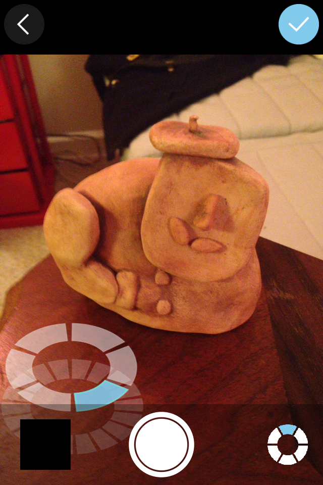
Last week, we visited the Ackland Museum to use one of their objects for our first foray into 3D scanning. I chose a squat, spouted object for my first project.
The phone app is a huge help in terms of starting out with lens distance and the number of photos required for a baseline. There is a 70 photo cut off, so don’t get too enthusiastic if you’re using the app. But if you follow their model (the blue segments), you get the right number with a sufficient amount of overlap to construct the 3D render.
But it’s certainly a lesson in patience. There are several stages of upload that require users to dredge up the patience we used to exercise when dial-up was our only option. JJ supposed that the wait time might be a part of the way the site processes the photos—maybe it’s constructing the model as it’s uploading the photo. If you have internet connectivity issues (the struggle is real, even on our university network), don’t worry too much—I walked too far from the building while it was ‘Finishing,’ and the app asked me if I wanted to continue on my data plan. Even still, it stayed on that ‘Finishing’ screen for hours. I finally just let the phone alone and went to bed. When I opened the app up the next day, it offered me the option of publishing the upload, which went speedily. So lesson learned: don’t attempt a project under time pressure.
The Autodesk application is meant as an intro to 3D scanning and potential printing (123D Make). So there’s a limit as to editing the model after it’s been uploaded. Pretty much all you can do is add tags and a description without any tools to manipulate the model itself. You can download several different file formats, though. It also allows you to share the project on various social media platforms or embed it (as seen in the first image). If you’re new to 3D scanning, this is definitely the way to start.
Agisoft PhotoScan (& Sketchfab)
PhotoScan, on the other hand, is better either for beginners with the option of a tutorial or for those with a little more familiarity with image manipulation software. The learning curve isn’t as steep as with Adobe products, however, since the basics of what you need to do (in the order they need doing) show up on the ‘Workflow’ dropdown of the menu. As you complete each step, the next steps are no longer greyed out. For each task completed, more of the toolbar is made available to you. For example, once the photos are aligned, the dense cloud constructed and the mesh build, you can view the various underlying structures of the model. To help fill in the gaps, you can use Tools>Mesh>Close Holes and the software will interpolate what’s missing. The best part, though, is that the default setting for all of the stages result in a respectable model that renders non-reflective surfaces and textures beautifully. For example, the model we constructed during class involved a brick wall, and it really did look like an actual brick wall by the time we finished, and just on the default (medium) settings. The only caveat: Make sure you’re working on a computer with a a good bit of memory behind it—the speed and capability of the processing is limited otherwise.
Once you have the model as you like it, you can use image editing software to alter the aesthetics of the model. DO NOT make any alteration (including cropping) to the photos in the process of taking them nor before aligning them. Once the photos are aligned, you can crop them in the program to hone in on the object. For the amount of light and sharpness, export the material file and .jpg. Edit the .jpg in your image editing software (it will look like an unrecognizable blob—just go with it) and then feed it back into the model for a reapplication of the texture by going to Tools>Import>Import Texture.
Once the model is perfected, you have the option of several export options. Did you know that Adobe Reader lets users move around a 3D model? It’s a fun and approachable option. The Wavefront obj file option allows you to to save without compression, though the file size is large.
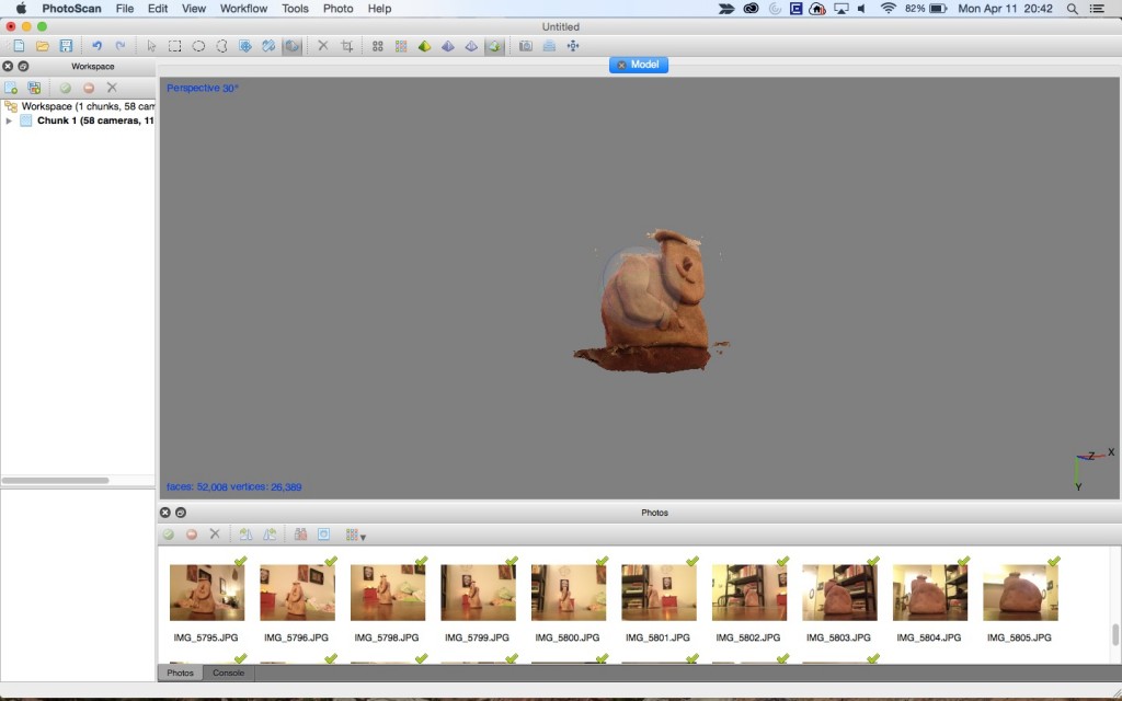 For this model:
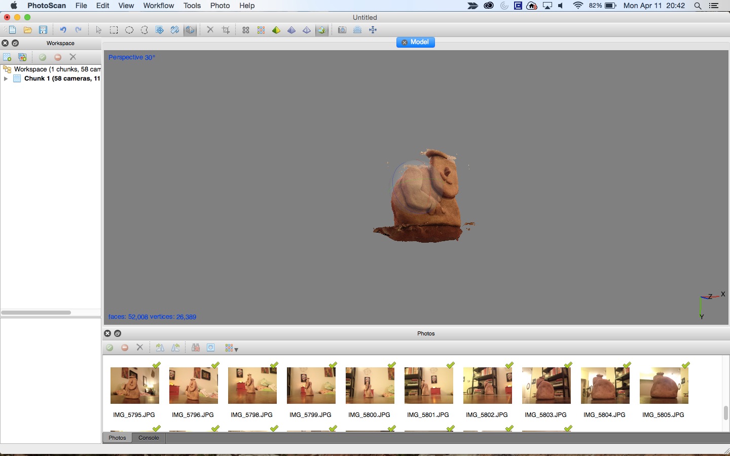
The photos that align properly show up with green check marks. I think part of the issue with this model is that I uploaded the photos slightly out of order, thus missing the full scan of the little Frenchman’s beret. That, the uneven lighting and the poorly contrasted background all contributed to the editing problems. If the model were better, it would be worth spending time with the magic wand or lasso tools to edit closer to the sculpture. For lighting, try to get neutral lighting that casts minimal shadows. Bright or harsh lighting not recommended. If you’re shooting outdoors, aim for cloudy days.
Sketchfab is a means of publicly sharing projects from 3D rendering programs. If you have paid for an Agisoft account, you can upload projects directly to Sketchfab. My account is super boring, since the free trial of PhotoScan won’t allow file export or saving. But RLA Archaeology has a fascinating and active account, so take a look there for a sampling of what Sketchfab has to offer as a public gallery of projects.
3D Printing
The process of creating the scan and watching such a textured image develop was gratifying—that scan being the one that we created in class with the brick, and not reproduced here. I’m certain that watching the model go through the 3D printing process would be equally fascinating. But the final product may be less satisfying. Most printers produce those heavily ringed models that require sanding before they look and feel more like a whole—rather than composite—object.
What’s really cool about 3D printing, though, you can use such an assortment of materials with which to print. For example, World’s Advanced Saving Project is building prototypes for affordable housing 3D printed from mud. Some artists are constructing ceramics from 3D models using clay (basically more refined mud). Still others are using metals for their work. The possibilities for art, architecture and material culture are overwhelming.
]]>For example, when one user looks at a record for Piet Mondrian’s Composition No. II, with Red and Blue, she may assign tags for colour blocking, linear and geometric. Another user may tag the terms De Stijl, Dutch and neoplasticism. By combining both approaches to the painting, the museum ensures that those without contextual knowledge have just as much access to their collections as those with an art historical background. Linking tags can allow users to access and search collections at their needed comfort level or granularity. It also frees up the time for employees handling those collections, since they can depend—at lease in part—upon the expertise and observations of their public.
The diversity of tags also increases findability levels for educational uses of online collections. If an elementary school teacher wants to further her students’ understanding of movements like cubism, she can just open up the catalogue of her local museum to explore the paintings tagged with ‘cubism.’ This becomes increasingly important as field trips are increasingly unavailable to public schools and larger class sizes require more class prep than ever. With the linked folksonometric vocabulary, the teacher need not fight for the field trip nor dedicate even more time to personally constructing a sampling of the online collection to display.
Crowd sourcing knowledge can also go beyond vocabularies and prove especially useful in an archival context.[1] When limited information is known about a collection or object and those with institutional knowledge are unavailable (a persistent problem plaguing archives), another source of information is needed. The best way to do that is to tap those who would have the necessary expertise or experience. For example, Wellesley College’s archive began including digitized copies of unknown photographs from the archive in the monthly newsletters emailed to alumni. With those photos, the archive sent a request for any information that alums could provide. In this way, the archive has recovered a remarkable amount of knowledge about the historical happenings around college.
But folksonomies and other crowd sourcing projects are only useful if institutions incorporate the generated knowledge into their records. Some gamify the crowd sourcing process in order to engage users, but then lack the impetus to follow through in terms of incorporation. Dropping the ball in this way may be due in part to technical challenges of coordinating user input and the institution’s online platform. It may also stem from the same fear that many educators hold for Wikipedia: What if the information provided is WRONG? Fortunately, both anecdotal and research evidence is proving those fears largely unfounded.[2] The instinct to participate with institutions in crowd sourcing is a self-selective process, requiring users to be quite motivated. Those interested in that level of participation are going to take the process seriously, since it does require mental engagement and the sacrifice of time. In terms of enthusiastic but incorrect contributions, institutions may rest assured that the communities that participates in crowd sourcing efforts are quite willing to self-police their fellows. If something is wrong or misapplied (eg Stephen Colbert’s Wikipedia antics), another user with greater expertise will make the necessary alterations, or the institution can step in directly.
GLAMs are experiencing an identity shift with the increased emphasis on outreach and engagement.[3] The traditional identity of a safeguarded knowledge repository no longer stands. GLAMs now represent knowledge networks with which users can engage. If obstacles exist to hinder that engagement, the institution loses its relevance and therefore its justification to both the bursar and the board. These open sourced projects can break down those perceived barriers between an institution and their public. Engaging with users at their varying levels and then using that input shows that the institution envisions itself as a member of that community rather than a looming, inflexible dictator of specific forms of knowledge. Beyond that, though, institutions can use all the help they can get. Like at Wellesley, an organization may be lacking in areas of knowledge, or they just don’t have the resources to deeply engage with all of their objects at a cataloguing or transcription level. Crowd sourcing not only engages users, but it also adds to an institution’s own understanding of its collections. By mining a community’s knowledge, everyone benefits.
From a more data science-y perspective: Experimenting with folksonomies in an image based collection
For a class on the organization of information, we read an article covering an experiment analyzing the implementation of user generated metadata.[4] For those in image based institutions looking to build on the attempts of others in the field of crowd sourcing, this experiment is a solid place to begin. Some alterations, however, may prove helpful. Firstly, I would recommend a larger pool of participants from a broader age range, at least 25-30 people between the ages of 13-75. This way the results may be extrapolated with more certainty across a user population. Secondly, for the tag scoring conducted in the second half of the experiment, I would use the Library of Congress Subject Headings hierarchy in tandem with the Getty’s Art & Architecture Thesaurus, so as to compare the user generated data to discipline specific controlled vocabularies. Retain the two tasks assigned to the users, including the random assignment of controlled vs. composite indexes and the 5 categories for the images (Places, People-recognizable, People-unrecognizable, Events/Action, and Miscellaneous formats). In terms of data analysis, employ a one-way analysis of variance, since it provides a clear look at the data, even accounting for voluntary search abandonment. By maintaining these analytical elements in the one-way ANOVAs and scoring charts for the pie charts, it would be easy enough to compare your findings with those in the article to see if there’s any significant difference in representations of index efficiency (search time or tagging scores) for general cultural heritage institutions and GLAMs with more image based collections.
[1] L. Carletti, G. Giannachi, D. Price, D. McAuley, “Digital Humanities and Crowdsourcing: An Exploration,” in MW2013: Museums and the Web 2013, April 17-20, 2013.
[2] Brabham, Daren C. “Managing Unexpected Publics Online: The Challenge of Targeting Specific Groups with the Wide-Reaching Tool of the Internet.” International Journal of Communication, 2012.
Brabham, Daren C. “Moving the Crowd at iStockphoto: The Composition of the Crowd and Motivations for Participation in a Crowdsourcing Application”. First Monday, 2008.
Brabham, Daren C. “Moving the Crowd at Threadless: Motivations for Participation in a Crowdsourcing Application”. Information, Communication & Society 13 (2010): 1122–1145. doi:10.1080/13691181003624090.
Brabham, Daren C. “The Myth of Amateur Crowds: A Critical Discourse Analysis of Crowdsourcing Coverage”. Information, Communication & Society 15 (2012): 394–410. doi:10.1080/1369118X.2011.641991.
Lakhani; et al. “The Value of Openness in Scientific Problem Solving.” 2007. PDF.
Saxton, Oh, & Kishore. “Rules of Crowdsourcing: Models, Issues, and Systems of Control.”. Information Systems Management 30 (2013): 2–20. doi:10.1080/10580530.2013.739883.
[3] “Throwing Open the Doors” in Bill Adair, Benjamin Filene, and Laura Koloski, eds. Letting Go?: Sharing Historical Authority in a User-Generated World, 2011, 68-123.
[4] Manzo, Kaufman and Flanagan Punjasthitkul.”By the people, for the people: Assessing the value of crowdsourced, user-generated metadata.” Digital Humanities Quarterly (2015) 9(1).
Further Reading on Crowd sourcing, Social media & Open access (drawn from JJ’s class syllabus for 11 April)
- Crowdsourcing Projects: Smithsonian Digital Volunteers and the Smithsonian Social Media Policy.
- Jeffrey Inscho, “Guest Post: Oh Snap! Experimenting with Open Authority in the Gallery,” Museum 2.0 (March 13, 2013).http://museumtwo.blogspot.com/2013/03/guest-post-oh-snap-experimenting-with.html
- Kristin Kelly. Images of Works of Art in Museum Collections: The Experience of Open Access. Mellon Foundation, April 2013.http://msc.mellon.org/research-reports/Open%20Access%20Report%2004%2025%2013-Final.pdf/view
- Nate Matias, “Crowd Curation: Participatory Archives and the Curarium Project,” https://civic.mit.edu/blog/natematias/crowd-curation-participatory-archives-and-the-curarium-project
- NMC Horizon Project Short List, 2013 Museum Edition,http://www.nmc.org/pdf/2013-horizon-museum-short-list.pdf
- Karen Smith-Yoshimura and Cyndi Shein, “Social Metadata for Libraries, Archives, and Museums” OCLC Research Report, Executive Summary only,http://www.oclc.org/content/dam/research/publications/library/2012/2012-02.pdf
- For those interested in Museum 2.0, Nina Simon, The Participatory Museum, http://www.participatorymuseum.org/
The England layer is far more detailed, with supplemental information from the addition of attributes to its data table (Link and Time period). It also holds more images and even a YouTube video (see the Bodleian Library pin).
The only real trouble I encountered was the number of layers the map would accommodate. When trying to add another route, the option was greyed out, informing me that I’d reached my limit. Other than that, the application was primarily intuitive and allowed me the freedom to manipulate it as I wished.
Post-publishing realization: The map automatically adds photos associated with the location after the photos (and singular video) that I linked to it myself. I’m working to figure out how to disable these media that aren’t mine.
]]>